Would you like to capture the colours of your travels in the Middle East in a way that feels simple and unforgettable? From the deep blues of mosque tiles to the warm golds of desert sands, every place here is full of colours that carry stories of culture, history, and daily life.
It can feel tricky to know where to start when there are so many shades around you. That’s why, after years of experimenting with water colour, I use a simple method: creating a palette that focuses on 3–5 main hues. With only a few colours, you can catch the essence of a scene in seconds — and bring it back to life long after the journey ends.
If you’d like to try this yourself, I recommend packing a few travel-friendly art supplies: a compact watercolour set and a sturdy A4 or A5 sketchbook. Some of my favourites are Winsor & Newton Cotman Sketcher’s Pocket Box (for the paints) and 1264Fabriano 300 gsm A4 (for paper). Click on links for more details.
Ready to begin? Here is your guide to creating beautiful palettes to embrace your Middle Eastern adventures!
The Language of Colour in the Middle East
From the vibrant souks to the desert landscapes, colours in the Middle East are not merely decorative; they are symbolic, carrying profound cultural and spiritual meanings. Understanding this language of colour is key to appreciating what you see in the region.
Symbolic Colours and Their Meanings
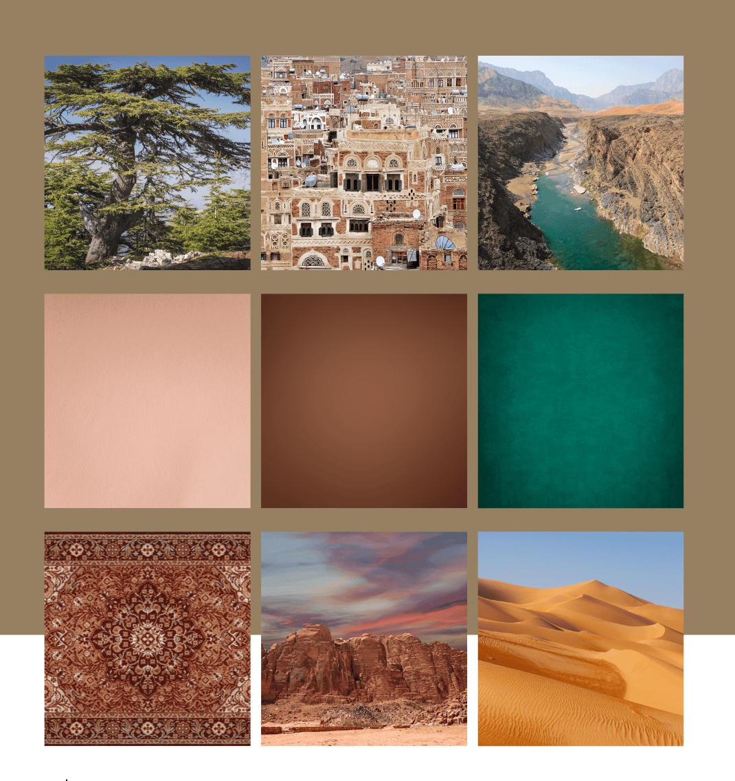
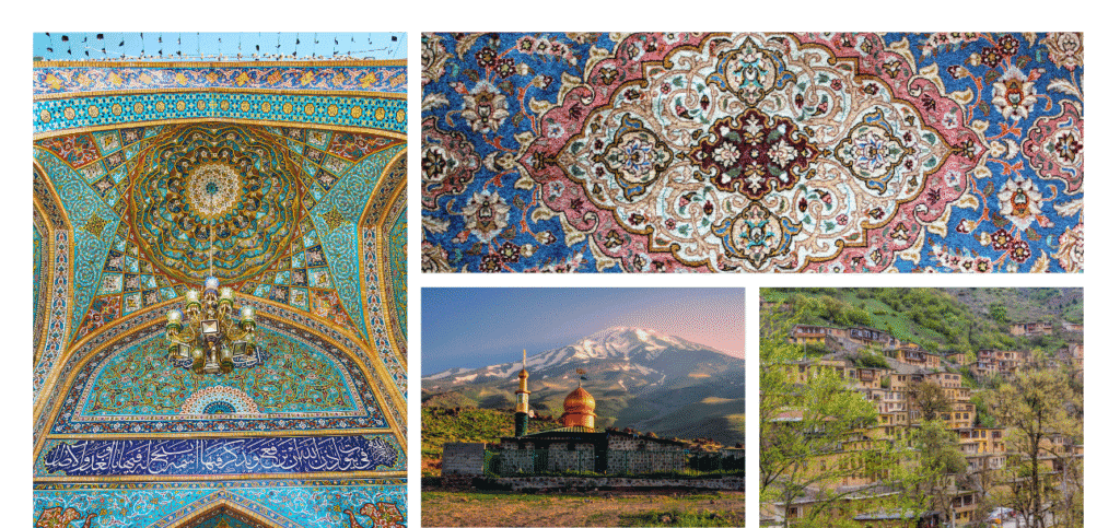
Blue: often connected with the heavens, spirituality, and protection. Think of the intricate blue tiles covering mosques in Iran or Uzbekistan. These create a sense of stillness and depth. I felt that same power of blue on my very first morning in the Middle East, when I opened the curtains in my hotel room in Amman. The sky outside was such an intense blue that it felt endless.
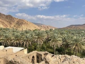
Green: Revered as the colour of Islam. Green symbolizes paradise, nature, fertility, and renewal. It is frequently seen in flags, religious texts, and lush Wadis such as Wadi Bani Khalid that spring out in the desert. The deep greens of olive groves in Palestine and date palms in the Gulf offer a refreshing contrast to the golden sands.
Gold & Yellow: These colours embody wealth, royalty, and the radiant sun. I think of the golden domes of mosques, golden ink in intricate calligraphy, and shimmering textiles. These all reflect the region’s rich heritage and artistic grandeur. Yellow, in its softer tones, also captures the warmth of the desert sun.
Red: A colour of passion, energy, and sometimes caution. Red is vibrant and commanding. It reminds me of intricate Persian carpets, traditional garments, and rich spices such as saffron found in Souqs such as Mutrah Souq. It also evokes the most fiery sunsets I have ever seen and the bold patterns of traditional textiles.
Earthy Tones (Beige, Brown, Ochre): These colours form the foundational palette of the Middle Eastern landscape. They represent the vast deserts, ancient mud-brick cities such as Birkat al Mouz, and the natural materials used in traditional architecture.
Practical Steps to Create Your Middle Eastern Sketchbook Palettes
I’m not a professional artist but over the years, I have experimented with sketching and water colour and found some winning techniques. My goal isn’t to replicate every shade I see, but to capture the feeling of a place. This means simplifying complex scenes into a handful of key colours that evoke its spirit. Here’s how I approach it:
1.Observe and Absorb: Before even opening my sketchbook, I spend time simply observing. What colours dominate the scene? What are the accent colours? How does the light affect them? I look for recurring patterns in architecture, textiles, and nature.
2.Identify Key Hues: I try to narrow down the palette to 3-5 main colours that define the scene. For example, in a bustling souk, it might be the deep reds of textiles, the vibrant blues of ceramics, and the earthy browns of the market stalls.
3.Mix and Match: I usually mix custom shades on the spot to get closer to the unique tones I’m seeing. This is where understanding the cultural significance of colours helps – it guides my choices beyond mere visual accuracy.
4.Test and Refine: I create small swatches in my sketchbook, noting down the location and the emotions they evoke. This process helps me refine my palette until it truly captures the feel of the place. I might also collect elements connected with textures (sand, vegetation, tiny pieces of construction materials…).
5. Finding Your Spot: When choosing where to sketch, look for good natural light, an interesting angle, and a place where you feel safe and relaxed. I try to avoid busy spots so I don’t draw a crowd, and if I can, I’ll tuck myself onto a small bench or in a café corner.
Regional Colour Journeys: Unveiling Middle Eastern Palettes for Artists & Travelers
Oman: Unveiling the Sultanate’s Signature Colour Palette for Travellers
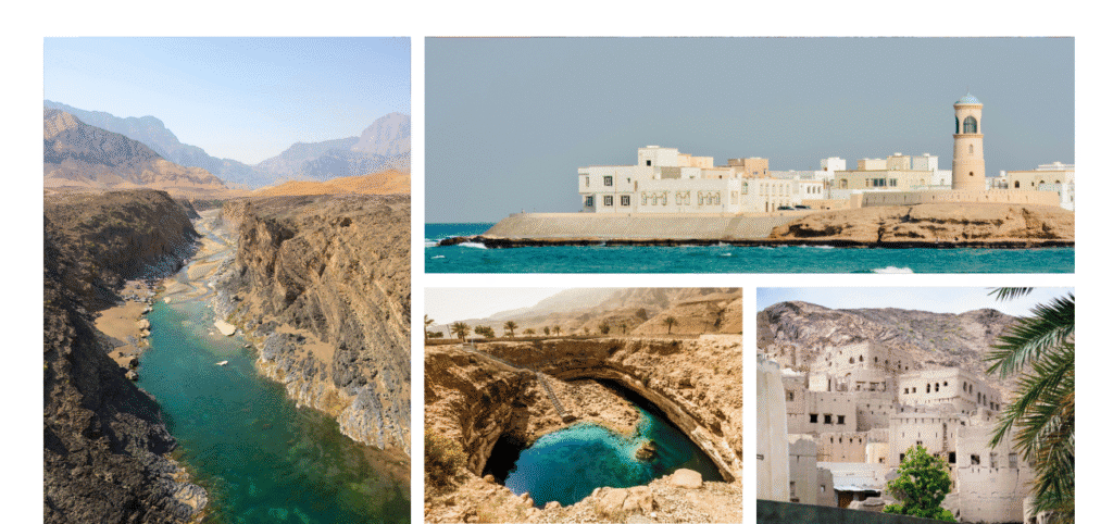
For my blog, Joussour to Oman, the Omani landscape offers a particularly rich and diverse palette. The dramatic contrasts between the golden desert dunes, the turquoise waters of the Arabian Sea, and the rugged, ochre mountains provide endless inspiration. The pristine white of traditional Omani architecture, often adorned with intricate wooden doors, adds a striking element to this natural canvas.
In Oman, you’ll find:
- Desert Gold: The shifting sands of the Wahiba Sands, ranging from pale gold to deep burnt orange, especially at sunrise and sunset.
- Ocean Turquoise: The crystal-clear waters of the Omani coast, from the fjords of Musandam to the beaches of Salalah, offering a spectrum of blues and greens.
- Mountain Ochre: The ancient, weathered rocks of the Hajar Mountains, displaying rich browns, reds, and deep purples.
- Frankincense White: The stark, clean white of Omani forts and houses, often contrasting beautifully with the natural landscape.
- Date Palm Green: The vibrant green of the date palm oases, providing pockets of lush life in the arid environment.
These are just a few starting points. The beauty of sketching on location is that every moment, every shift in light, reveals a new facet of the colour story. It’s about being present, observing deeply, and allowing the spirit of the place to guide your hand.
To go deeper into the colours of Oman, you might also enjoy this piece called ‘The colors of Oman: Nature, Nurture and Nostalgia’
Beyond Oman: Exploring Diverse Middle Eastern Colour Palettes for Your Art
While Oman offers a distinct palette, the broader Middle East is a tapestry of diverse colours, each region telling its own unique story through its visual language.
Iran: Decoding Persian Colours – A Guide for Artists & Travellers
Although I have never travelled to Iran, I want to include it here. Historically known as Persia, the country boasts a colour tradition deeply rooted in its rich artistic and spiritual heritage. Persian art, architecture, and textiles are renowned for their intricate patterns and vibrant hues, often carrying profound symbolic meanings.
- Persian Blue: More than just a colour, Persian Blue is iconic, representing spirituality, the heavens, and tranquility. It’s prominently featured in the dazzling tilework of mosques and palaces, creating an ethereal atmosphere.
- Turquoise: Closely related to Persian Blue, turquoise is also highly valued, symbolizing protection and good fortune. It’s frequently used in jewelry, ceramics, and architectural details.
- Gold & Saffron Yellow: These colours signify wealth, divine light, and prosperity. Gold is used in illuminated manuscripts, miniature paintings, and intricate metalwork, while saffron, a precious spice, lends its warm yellow to culinary traditions and dyes.
- Emerald Green: Symbolizing paradise, growth, and renewal, emerald green is often found in garden designs, textiles, and ceramic glazes, reflecting Iran’s appreciation for nature.
- Crimson Red: A colour of passion, sacrifice, and vitality, crimson red is a powerful hue seen in traditional Persian carpets, often used to create striking contrasts with blues and greens.
Jordan: Capturing Desert Earth & Ancient Stone Hues in Your Sketchbook
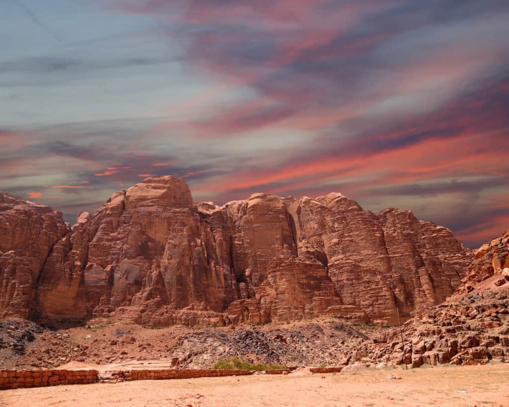
Jordan’s landscape includes majestic deserts and ancient rose-red cities, shaping a palette that speaks of resilience, history, and natural beauty.
- Rose Red (Petra Red): The most iconic colour of Jordan, derived from the sandstone city of Petra. This deep, earthy red symbolizes the ancient history and the enduring spirit of the land.
- Desert Sands (Beige & Ochre): Reflecting the vastness of the Wadi Rum desert, these warm, natural tones represent the timeless beauty and ruggedness of the Jordanian landscape.
- Sky Blue: The clear, expansive skies over Jordan provide a serene blue, often contrasting with the warm desert tones, especially at dawn and dusk.
- Olive Green: In the more fertile northern regions and wadis, olive green signifies life, sustenance, and peace, a stark contrast to the arid desert.
- Black & White (Bedouin Colours): These fundamental colours are often seen in traditional Bedouin textiles and tents, representing simplicity, resilience, and the stark beauty of desert life.
Lebanon: Sketching the Verdant Coast & Mountain Peaks – A Colour Guide
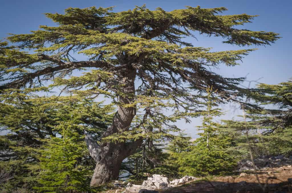
Lebanon, the land of cedars, presents a vibrant palette shaped by its diverse geography – from the Mediterranean coast to the snow-capped mountains and fertile valleys.
- Mediterranean Blue: The deep, inviting blue of the Mediterranean Sea is a defining colour of Lebanon, symbolizing tranquility, openness, and its historical connection to maritime trade.
- Cedar Green: The iconic cedar tree, a national symbol, lends its rich green to the Lebanese palette, representing resilience, eternity, and the country’s natural beauty.
- Mountain White: The snow-capped peaks of Mount Lebanon, visible for much of the year, contribute a pristine white, symbolizing purity and peace.
- Earthy Terracotta & Stone: Reflecting the traditional architecture and ancient ruins, these warm, natural tones speak of Lebanon’s deep history and connection to the land.
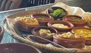
- Vibrant Market Hues: The bustling souks and markets burst with colours from fresh produce, spices, and textiles – a lively mix of reds, yellows, oranges, and purples that capture the country’s energetic spirit.
Yemen: Discovering the Ancient Soul of Arabia Through Its Earthy Palettes
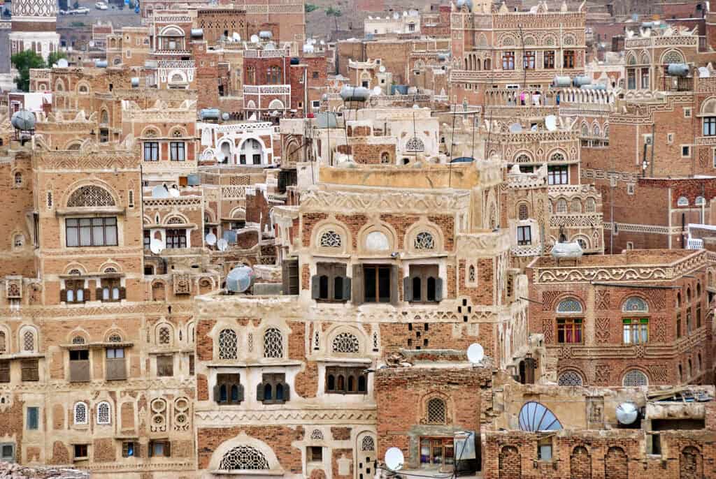
Yemen, with its ancient cities, dramatic landscapes, and rich cultural traditions, offers a palette that is both earthy and deeply spiritual, reflecting its unique position at the crossroads of ancient civilizations. The first time I saw pictures of the houses in Sana’a, the capital of Yemen, I was awestruck by their unique colours of brown and cream.
- Earthy Browns & Creams: The first time I saw pictures of the houses in Sana’a, the capital of Yemen, I was awestruck by their unique colours of brown and cream. Along with the vast desert landscapes, they define Yemen’s foundational palette, symbolizing tradition, resilience, and connection to the earth.
- Deep Indigo & Rich Reds: These colours are prominent in traditional Yemeni textiles, particularly in women’s clothing and intricate embroidery. Indigo often represents depth and mystery, while rich reds signify vitality and cultural heritage.
- Subtle Greens: Found in the terraced fields and wadis, these greens represent life, agriculture, and the preciousness of water in an arid land.
- Gold Accents: Yemeni jewelry and traditional adornments often feature intricate gold accents, adding touches of elegance and historical richness to the overall visual landscape.
More Than Just Paint: Elevating Your Middle Eastern Travel Journal
When I travel with my sketchbook, I’ve learned that the colours don’t just come from paint. Some of my favourite pages are the ones where I’ve mixed in scraps, notes, and even quick memories of what I could hear or smell at the time. All of these things help me build palettes that feel alive — not just a collection of swatches, but a story on the page.
Treasures from the Journey: Incorporating Found Objects & Ephemera into Your Art
I often tuck little finds into my sketchbook. A bright pink petal pressed between the pages, a piece of coloured shiny paper from the ‘Chips Oman’ package, or even a museum ticket. Later, when I open my journal, those scraps instantly bring back the colours of that day more vividly than paint alone ever could.
Blending Hand-Lettering & Journaling with Your Sketches
Sometimes, a quick line in my own handwriting captures the moment as much as the paint. I might write the name of a place in a colour pulled straight from the scene — blue for tiles, or gold for desert light. I’ve also scribbled down Arabic words I’ve just learned, pairing them with the shades I saw around me. It’s a simple way of weaving words and colour together.
Using Photography as Inspiration for Your Middle Eastern Palettes
I don’t always have time to sketch on the spot — especially in busy markets. So I snap photos freely, and later they help me notice colours I missed. A quick shot of lanterns hanging in an alley, for example, may reveal tiny splashes of turquoise and red I hadn’t painted at the time. Photography becomes a kind of colour bank I can dip back into.
Evoking Atmosphere Through Sensory Descriptions in Your Journal
Not all colours come from what you see. Some are linked to what you hear and smell. I remember writing down “blue” next to the call to prayer at dusk in Amman, because the sound and the sky felt inseparable. The smell of frankincense will always evoke =gold” to me. Adding these notes in the margins makes the colours on the page feel richer, layered with memory.
Your Journey, Your Palette
As a travel sketcher, the beauty lies not just in observing these colours, but in interpreting them through your own lens. Each stroke of your brush, each choice of hue, becomes a personal dialogue with the place. Whether it’s the electric blue of a mosque in Iran, the rose-red glow of Petra, the verdant green of Lebanon’s cedars, or the ancient ochre of Yemen’s cities, these palettes invite you to look deeper, feel more, and remember the Middle East not just as a collection of sights, but as a symphony of colours.
Happy sketching, and may your palettes always be vibrant and full of stories!
If you’ve created your own Middle Eastern palettes or travel sketches, I’d love to see them — share a photo or a note in the comments below so we can inspire each other.
Frequently Asked Questions about Middle Eastern Colour Palettes
Q: How can I use Middle Eastern colour palettes in home decor?
A: Try bringing them in through textiles like cushions, rugs, or wall art. Even a single accent colour — such as turquoise or saffron yellow — can create a strong Middle Eastern feel.
Q: Are Middle Eastern colour palettes suitable for modern design?
A: Yes. These palettes work beautifully in contemporary settings when used with restraint. Pair bold hues (like Persian blue or crimson) with neutral backdrops for balance.
Q: Can I create digital Middle Eastern colour palettes?
A: Definitely. Tools like Canva, Coolors, or Adobe Color allow you to pull shades from travel photos and build ready-to-use palettes for design projects.
Q: What’s the difference between Middle Eastern and Mediterranean colour palettes?
A: Middle Eastern palettes often lean toward deep blues, golds, and earthy tones tied to deserts and Islamic art. Mediterranean palettes feature more sea-inspired blues, whites, and sun-washed pastels.
Q: Where can I find inspiration for Middle Eastern palettes online?
A: Pinterest boards, museum collections (like the Met or V&A), and travel photography sites are excellent places to study authentic colour combinations before trying them in your art or journal.


13 responses
Hello
Is there an app or a map showing the speed radars of Oman?
Estarei em Omã no final de setembro e suas informações me ajudaram muito na escolha do Hotel!
Obrigada Christine
Merci Christine pour ce temps passé à nous décrire comment se sentir comme chez toi, chez nous !
J’ ai voyagé encore !
À bientôt ✈️
C’est un plaisir, Anne. Vraiment!
Wow❤️
Thanks. If you need more information about accommodation in Muscat or other aspects of travelling in Oman, don’t hesitate to ask.
Awesome !! THANK YOU FOR SHARING, ITS VERY IMPORTANT TO LET OTHER CULTURES KEEP THERE CULTURE.
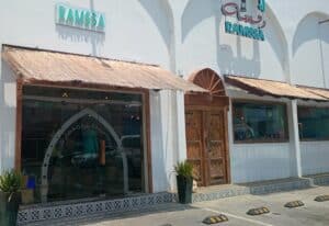
Hi Christine, thank you so much for the restaurant recommendation. I loved the food, the atmosphere and the place in general. I also talked to Khaled, the supervisor. He says hi. Thank you again. Tomorrow is my last day in Muscat. Any last minute must- see places?
Saliha from Algeria
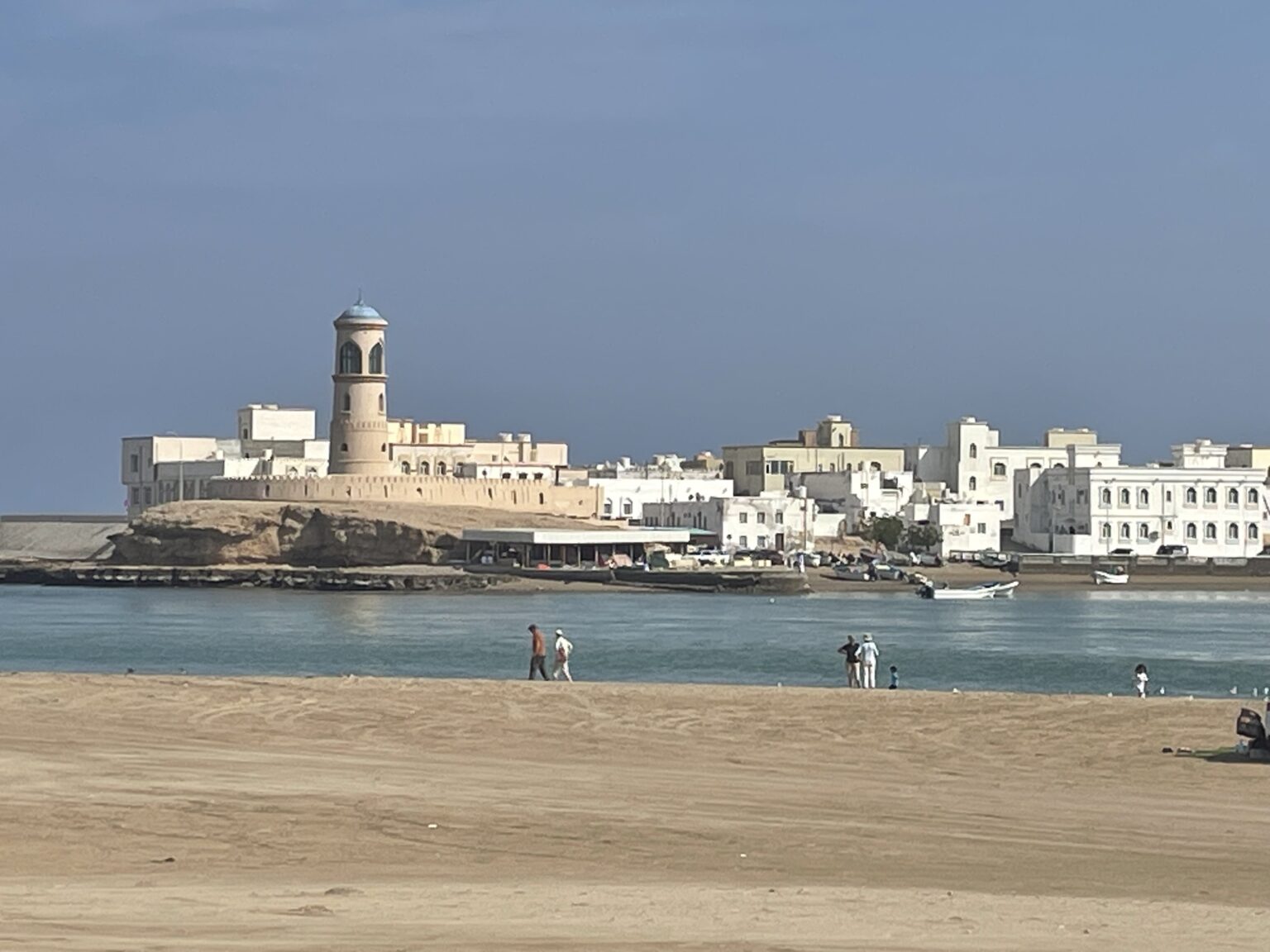
Hello Saliha, Glad to hear you enjoyed the restaurant. In terms of Muscat, there are many options but some must-sees are Muttrah (the Corniche, Souq and Fort), Al Qurum (Shatti Al Qurum with its beach, the Opera building), and Old Muscat (the Royal Palace and gardens around, the Bait Al Zubair museum). I hope you get to see some of these. Have a great day!
HI! Thanks for your advises are planning to go to Oman during Ramadan this year. Could you please advise what is better to book apartment or Hotel?
Awesome !!